
TLDR
What is it?
This is a template for a company’s Tone of Voice Guidelines. It outlines how the company speaks to its users and helps the writers understand how the company sounds.
It also provides basic grammar rules, accessibility tips, inclusive language ideas and more.
Why make it?
As a freelancer, I’ve worked on three different style guides and noticed that each one had something missing.
I also found myself wishing for a template that I could use so I wouldn’t have to copy text directly from one company to another.
This pain point inspired the creation of this template.
Important Note!
A great deal of time and effort has gone into the making of this template. I am happy to share the template, so please contact me if you are interested in using either the template or my expertise. Both are recommended 😉
Table of Contents
What is tone?
Tone is how your company communicates to its users. Choosing a tone that aligns with your company’s brand or corporate identity is crucial. The following sections show the building blocks for how to achieve this.
The writing tense will affect how users interact with your platform and also how they feel about it.
1st person (i.e. ‘I’, ‘we’) should be used when referring to [your company] and the people who work for [your company]:
We do our best to deliver the best experience possible for our members
It’s used most frequently when describing what we’re offering members on our platform.
Note: We don’t use ‘I’ when writing on the platform itself unless we’re speaking from the perspective of the user e.g. ‘I’m not interested in offers’. When writing from the perspective of [your company] use ‘we’ and ‘our’.
2nd person (i.e. ‘you’) should be used when referring to our members or suggesting actions they can take:
You can buy our product here
You can find more options here
It’s used most frequently when showing the user what they can do on the platform and how to achieve it.
3rd person (i.e. ‘he’, ‘she’, ‘they’) can be used when referring to examples of other users. Depending on your product you may have users who interact with each other, in which case you refer to a member’s contacts or other people not directly involved in the conversation between the platform (us) and the member (you):
Want to reach out to this contact? Send them a message
If your platform doesn’t include contact between users, try to avoid the use of 3rd person pronouns. By referring to your users in the second person, it allows you to talk directly to them and endear the user to your brand.
Addressing the user as ‘you’ has an added side benefit of including everyone and avoids alienating people by using ‘he’ or ‘she’.
If you must use the third person, consider using ‘they’ as it includes all genders and ensures everyone is included. It’s also shorter than he/she variants.
Formality determines how close you are when communicating with your users on a conversation level. Formality creating more distance and casual language bringing the user and company very close. Both have advantages and disadvantages and the choice will depend on your company’s brand or corporate identity, the service you provide, the age of your users and many other factors.
If you want to write text with a formal tone, imagine you are addressing an important business associate. You will want to treat them with respect and professionalism and because of that, there will be a certain distance between you.
You should avoid using contractions in order to maintain distance and professionalism:
If you would like to arrange an appointment, please contact our customer service team here.
You will also want to avoid slang and choose words that may have a more sophisticated ring.
You may also note that this section has been written using a formal tone.
If you want to write text with a semi-formal tone, imagine you’re addressing a respected colleague. You’ll treat them with respect and professionalism but you also have some level of familiarity with them.
You can use contractions here and there though it’s a good idea to use them carefully:
If you’d like to arrange an appointment, you can contact our customer service team here.
You’ll also want to avoid slang and choose words that sound professional, but not too stuffy.
You might also notice that this section was written using a semi-formal tone.
If you’d like to write text with a more balanced tone (a good mixture of formal and casual), imagine you’re speaking with an acquaintance. You’ll treat them with respect but you’ll also have some level of familiarity with them so the tone will sound a little warmer.
You can use contractions here and there but try not to use too many of them in the same sentence:
If you’d like to make an appointment, feel free to contact our customer service team here.
Where necessary you can drop in a hint of appropriate slang and choose words that are friendly but still respectful. Selective humour is also welcome.
You’ll likely notice that this section was written using a balanced tone.
Want to write semi-casual? Imagine you’re chatting with your friend. You’ll treat them with friendliness and warmth, maybe even a bit of playfulness.
Feel free to use all the contractions you like, just try not to go too crazy with them:
Let’s chat! Drop our team a line and we’ll figure out what you need.
Appropriate slang is welcome and the odd joke won’t hurt as long as you have a decent sense of humour (don’t try too hard). Choose words with a more casual feel but don’t forget, you still need to write your grammar correctly.
You’ll probably realise this section was written with a semi-casual tone.
Wanna write casually? Imagine you’re chatting with your best buddy. You’ll treat them with the warmth and playfulness you’d expect from someone you’re super close to.
Use contractions as much as you want! Within reason though:
Let’s chat! Drop us a line and we’ll get you sorted.
Use appropriate slang, especially words users will know and love. Don’t be shy to crack a joke or two as well – you wouldn’t hold back for your best friend, right?
Also, keep your words down to earth. No stuffiness or uptightness among friends. That said, this isn’t an excuse to be rude or lazy with your grammar.
I’ll bet you guessed this was written with a casual tone, didn’t you?
If you want to engage your users, speak to them like a person. Sounding like a robot will only put distance between you and using the words they’d use will also help them understand you better.
For example, instead of ‘Authentication error’ say ‘The wifi couldn’t connect’.
‘Authentication error’ doesn’t sound like something a human would say. ‘The wifi couldn’t connect’ on the other hand, is how people describe an authentication error.
Overall, a good rule of thumb is to write as though you’re sending a voice message. Depending on your level of formality this could be:
A voice message to a business associate (formal)
A voice message to a colleague (semi-formal)
A voice message to an acquaintance (balanced)
A voice message to a friend (semi-casual)
A voice message to a close friend (casual)
An example of login text using conversational language for your level of formality:
Are you new to our site? Or do you have an account? (formal/semi-formal)
New to our site? Or already have an account? (balanced)
First time here? Or know your way around? (casual/semi-casual)
Deciding how complex your language is doesn’t have to be. The following steps outline tips to help select a level of complexity that will work for you and your users.
Your target group will determine how complex your language needs to be.
For example: addressing scholars will be very different to how you’d address teenagers.
Keeping your target group in mind will help create the right level of complexity so users can understand what’s being communicated without feeling they’re being spoken down to.
Not everyone who interacts with a given language is perfectly fluent. Keeping this in mind while writing can improve the user experience on the platform as a whole.
You can do this by:
– Keeping your message short and easy to grasp
– Avoid contradictions like ‘definitely maybe’, ‘upwards fall’ and ‘absent presence
– Being wary of idioms or colloquialisms and explaining those that can’t be avoided
Even native speakers can get frustrated with overly complicated language, so keeping things simple helps everyone in the end.
Where possible, keep technical language and jargon to a minimum. We can’t expect our users to know all our systems and processes.
If a technical term must be used, be sure to explain its relevance to the user and/or how they can use it to do what they need to.
Also be sure to align on technical terms within [your company], including any other people or departments who might use them. A glossary or term bank is helpful for new employees and those who don’t interact as closely with certain terms.
Additionally, you should always clarify words or terms you don’t understand to avoid misunderstandings and extra work later.
Languages, customs and what is socially acceptable change from country to country. You may need to adjust certain words, phrases or even parts of the product to suit local needs.
In any case, make sure you find a native speaker of the language and a resident of the country to ensure your product is localised appropriately.
For example: ‘Discussion’ in English has a slightly different meaning to ‘Diskussion’. Even though they sound similar, a discussion in English might not be serious, while a ‘Diskussion’ in German almost certainly is.
Contractions can be used to varying degrees and should be used carefully depending on the level of formality your company is writing in.
List: Don’t, didn’t, doesn’t, hasn’t haven’t, can’t, isn’t, aren’t, weren’t, won’t, couldn’t, wouldn’t, shouldn’t, I’m, you’re, we’re, they’re, I’ve, you’ve we’ve, they’ve, who’ve, could’ve, would’ve, should’ve, I’ll, you’ll, we’ll, they’ll, who’ll, I’d, you’d, we’d, they’d, who’d, it’s, who’s, what’s, where’s, that’s, here’s, there’s, let’s.
Avoid contractions where possible in formal language. If the need arises: aren’t and weren’t may be possible to use.
We have not been able to contact you and will try again another time. If there are times when you aren’t available, we would appreciate it if you could let us know the best time to contact you.
If writing in a semi-formal tone: don’t, haven’t, can’t, couldn’t, wouldn’t, shouldn’t and you’ll are also possible options but should be used sparingly.
We haven’t been able to contact you and will try again another time. If there are times when you aren’t available, we would appreciate it if you could let us know the best time to contact you.
If you’re writing in a balanced way, be sure not to use too many contractions in one sentence.
We haven’t been able to contact you so we will try again another time. If there are times when you aren’t available, we’d be grateful if you could let us know the best time to get in touch.
Try to avoid the following contractions if you can, as they sound a bit too casual: could’ve, would’ve, should’ve, I’d, you’d, they’d, who’s, what’s, where’s.
You may use most contractions if you’re writing casually – it helps bring you much closer to the user.
We haven’t been able to reach you so we’ll try again later. If you’ve got a preferred time window for us, we’ll try to contact you then. Just let us know!
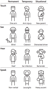
Disabilities come in many forms, which is why accessibility is so crucial. Disabilities can come in the form of permanent, temporary and situational disabilities.
Ever had trouble hearing someone in a loud room or area? If so, you’ve experienced a situational disability.
In the end, designing and writing with accessibility in mind helps everyone. This is why we write inclusively so that everyone, no matter their situation, has access to our products and services.
Writing accessibly is vital. It ensures everyone can read your page or app whatever their situation. To be able to write accessibly, you should keep the following points in mind.
Use plain language
Keep your language simple and easy to understand. The more complicated your writing is, the harder your users will have to work to understand it and the more likely they are to give up.
Avoid figures of speech, idioms and complicated metaphors
Not everyone knows every quote or idiom in their own language, let alone a second one. This doesn’t mean you can use them, but be careful with how you do it, as there will be some users who get left out and may feel bad because of it.
Avoid contradictions
This includes things like ‘definite maybe’, ‘upwards fall’, and ‘absent presence’ because they make it difficult for users to understand which word should be emphasised.
Use short sentences
Aim for a maximum of 25 words per sentence and stay as concise as possible without losing comprehension. (Like so)
Use short paragraphs
Aim for a maximum of 5 sentences per paragraph.
Use active voice instead of passive voice wherever possible
If you’d like more information on how to do this, check out the active voice section.
Avoid directional language
Writing directions in your text, such as ‘click the box on the left’, make it difficult for those with screen readers because their information is received linearly.
Write instructions that make sense regardless of the page layout
As mentioned in the previous section on directional language, users will interact with your site in different ways, whether it’s on the web, mobile, or using a screen reader.
As we’ve done in the sentence before, it’s best to be clear when referencing different sections (whether it’s sections of text or sections of your site).
Using the name of the section will always be clearer, and words like ‘previous’ or ‘following’ can provide direction without using spacially directional language.
You can help those with different mental capabilities by simplifying your structure, making small grammatical changes, and adjusting a few small things to make users’ lives easier. This section will explain these steps in more detail.
The structure of your content can have a big impact on how well users understand it. There are two main ways to achieve this.
1. Information hierarchies
Ensure information is organised in a hierarchy from most to least important. You can also keep your sections as concise as possible, so your users can digest them in small chunks.
2. Scanability
Keep your information scannable by using clear headings for each section. Keywords are also a great way to make your text scannable, especially when you highlight them using bold text. Just be careful not to highlight too many words in bold!
According to Nielsen Norman Group, numbers should also be written in numerical form if they’re being used to describe a number. There are a couple of exceptions:
– We’ve received thousands of reviews (as the number is an approximation)
– We’ve received 2 billion dollars in funding (any number over a million should be written this way)
Some grammatical symbols can be difficult for users, or the technology they use, to understand. Here are some to look out for.
1. ALL CAPS
Some screen readers read all-caps text letter by letter. It’s also difficult for people with dyslexia to read words written entirely in capital letters. To make this easier, you can use bold text to highlight important words or surround important text with a box or frame to make it stand out more.
2. Hyphens and Dashes
Avoid using these if you can. Hyphens ‘-’, En dashes ‘–’ and Em dashes ‘—’ can all be substituted with commas or semi-colons depending on where they’re used. Of course, you can still use these next to numbers but try to avoid them where you can in other types of text.
3. Ampersand ‘&’
This can make navigation when using a screen reader difficult. It’s best to use ‘and’ where you can because some screen readers can only recognise ampersands when they’re coded in HTML a certain way.
Here are some tips and tricks for formatting for an easier cognitive experience.
1. Avoid abbreviations
Abbreviations slow down the flow of reading so it’s better to write out the full word where you can as it’s easier for the users to read. There are some abbreviations, however, that may be used as they’re so common they’ve become part of the language. You can find a list of these in the section on abbreviations.
2. Avoid acronyms
It’s best to write out acronyms where you can. If you absolutely must write the acronym, write out the full name followed by the acronym in brackets the first time it appears in the text. After this, you may use the introduced acronym in the rest of the text.
For example: Laugh out Loud (lol) is internet slang that’s used to show humour. One may lol at many things.
3. Ensure tables are screen-reader compatible
Tables must be coded with the proper HTML code tags so screen readers can read them. It’s also important to make sure that the rows and columns are related to each other to avoid confusion.
4. Avoid italics and strikethrough text
Italics and strikethrough text can be difficult for users to read, with some fonts, nearly impossible. Avoid using these on any part of your site.
The one exception for strikethrough text is if you’re using it to show a price change on an online shop or pricing page.
What is alt text, and how should it be written?
Alt text is connected to images to describe them to assistive technology (like screen readers) and search engines.
It’s used to help those who can’t see images interact smoothly with the page and is tailored to improve their experience. As a result, buttons and icons also need alt text that gives the user context as to how they should be used.
There are a few ways to write alt text and each has different needs. However, all alt text should follow these rules:
– All non-decorative images require alt text
– The text should be concise and informative
– Do not write ‘Image of’ or ‘photo of’ in the text (this is already explained by screen readers)
– Decorative images or shapes should be left blank
– Do not write text for title fields
– Mention the differences between two identical pieces of text with different colours or other attributes.
Writing for images
Tailor your text to the context of the page and image.
If you have a picture of a server carrying a slice of cake and a cup of coffee, your alt text could differ depending on the context.
For a page about serving jobs:
A server brings their customer a tray with a smile.
For a page about a bakery:
Delicious cakes on a tray held by a server.
For a page about coffee:
A cup of coffee with a fern pattern in the froth on a tray.
As you can see, the alt text focuses on the part of the image that’s relevant to the topic of the page. This is to avoid confusion as an overly descriptive alt text will pull the user away from the purpose of the image – to accompany and strengthen the meaning of the text.
Writing for linked images
If you’re using an image as a link, it’s important to focus on the function of the link rather than the description of the picture. Describing too many things in a single image can cause confusion and frustration so it’s better to focus on the image’s purpose in this case.
You have a picture of a question mark that links to the FAQ page on your site.
In this case, your text should read: ‘Visit our FAQ page’ rather than ‘Question mark’.
Writing for icons
Icons need to state clearly and concisely whaat they are designed to do in the flow.
For example:
– A download icon should state ‘Download PDF’ (of course, if it’s not a PDF, it should state what it’s downloading)
– A menu icon should state ‘Open menu’
– A heart icon should state ‘Like post’
Writing for complex images
Graphs, charts and maps contain a lot of information and require a carefully written text alternative.
The most important things to keep in mind are:
– Structure of headings and overall information: ensure you write the information in a structured way. Anything about a particular topic should be contained within an appropriate heading and not spill into other sections.
– Make it easy for users to understand: give your users the information they need in an understandable order. For example: telling someone how to tie their shoes before putting their shoes on is confusing and doesn’t keep the user’s context in mind
Text size and spacing
– Make sure your font is no smaller than 14px, with 16px being preferred
– Set line spacing to at least 120% of the font size
– Set paragraph spacing to at least 1.5 times the line spacing
Letter spacing
There are certain letters that can be confused with other letters; for example, ‘rn’ can be mistaken for ‘m’ if the letters are too close. Ensure the following letters can be clearly distinguished, and if they can’t be, increase the letter spacing.
– rn shouldn’t look like m
– cl shouldn’t look like d
– Fi should look like A
– LI shouldn’t look like U
– ITI shouldn’t look like M
– cj shouldn’t look like g
– vv shouldn’t looks like w (same with the uppercase variants)
Coming soon
Coming soon
Coming soon
Coming soon
Coming soon