kleineKinos Small Cinema App – UX Case Study
kleineKinos is an app dedicated to delivering movies to small cinema lovers in Regensburg, Germany. It aims to delight users with its wide array of films, cinemas, filters and language options to help the many students living in Regensburg.
The study attempted to make searching for movies at smaller cinemas, who often boast slow, outdated websites, easier and more efficient. It also aimed to provide easier cinema access for international residents and students by highlighting movies in their language. An aspect of making the app more accessible for senior citizens was originally planned, however, it became clear that extensive research would be required and so it was deemed too large for the scope of this study – it is however, something I would like to do some more research into and would like to make a dedicated case study towards building an assistant for less tech-savvy individuals.
TLDR
User Problem
Residents of Regensburg have multiple small cinemas to visit and enjoy, however, their websites are not responsively designed and there is no dedicated app to assist with ticket sales. Younger users shy away from purchasing tickets in person and prefer to do it online (a difficult task when the websites are hard to navigate or understand). Added to this, international students and residents have difficulty finding films in either their language or English; finding them often requires a certain level of German comprehension and a fair amount of research. Users are unwilling to put in that kind of time and often resort to streaming due to the wide range of options, lesser perceived cost and ease of finding things in their language.
Business Problem
Small cinemas in Regensburg are missing out on potential clientele (namely students looking for cheap tickets and avid indie movie fans from out-of-town) due to their outdated websites and hard-to-find movie options for foreigners. International students and residents have a difficult time finding affordable movie options in their language and do not want to invest copious amounts of time in researching and translating everything from these sites. Indie film-lovers are also left out in the cold, especially those from out-of-town, because they wish to see cutting edge films but know that google cannot capture all their options and often give up in disillusionment, resorting to streaming and leaving small cinemas with less business.
The loUX Solution
A dedicated app to showcase all the offerings small cinemas in Regensburg have to offer would aptly solve many of these user problems. An app allows filters and searches to assist finding movies in certain languages (allowing international residents a wider range of options), it would ensure that users find all available movies from cooperating cinemas (assisting users in finding their desired film from a number of offerings) and it simplifies and unifies the purchasing system so that users can easily and conveniently purchase their cinema tickets from their phone. Ideally all small cinemas in the city would take part in the app, thus allowing users the widest range of choice and the most ease and comfort in their film search and viewing.
Key Takeaways
Learning
I learned a great deal from my first UX Project with the Google Coursera Course. It taught me a great deal about the UX process and about how to cater to user needs in an empathetic and practical way. User testing helped me decipher ways I could improve my information architecture and make the navigation and filter systems far more intuitive and user friendly. It was also a wonderful introduction to Figma and I learned a lot of creative ways to use Figma’s robust software to create near-to-product prototypes.
Project Use
This app is admittedly a utopian solution to the problem. It assumes that multiple businesses would agree to subscribe to using this platform in order to avoid annoying advertisements for users. Designing the app for a larger cinema with multiple locations may have been a wiser business strategy as it doesn’t hinge on cooperation from different organisations. Thankfully the design is flexible enough to adapt to different types of cinemas; rebranding and changing the content would suffice to adapt it for another investor.
Interview Skills
Another major takeaway was in my research and interview processes. I realised how tricky it is to draw the line between personable and interruptive in interviews. Remaining neutral while still drawing out a user’s feelings is a skill that I will need to hone over the course of future interviews and studies. During my initial hallway testing I also saw that I can improve the way I entice users to partake in my interviews by being more outgoing and engaging with them directly rather than simply waiting for people who seem interested enough.
Efficiency
An important take away for me is that less is more. By the end of the project I had a high fidelity prototype with over 1000 different artboards including a functional light and dark mode along with pre-programmed filters and search functions. For future projects I endeavour to boil the prototypes down to the essentials and to really weed out the nice-to-haves that could come as part of later iterations. This will increase my efficiency but allow for later iterations where these nice-to-haves could eventually be included.
For Those Who Want More….
The Case Study
Feel free to take a look through the case study I did as a part of the Google Coursera course in the provided slide deck.
And for your viewing pleasure here’s my High-Fidelity Prototype of the kleineKinos App
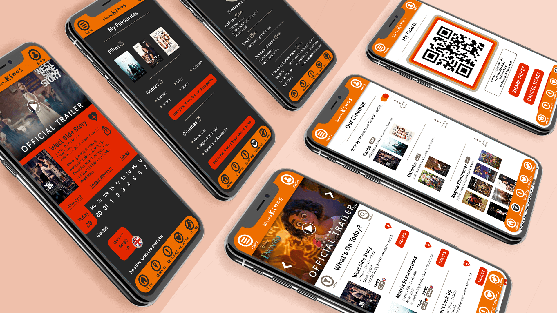
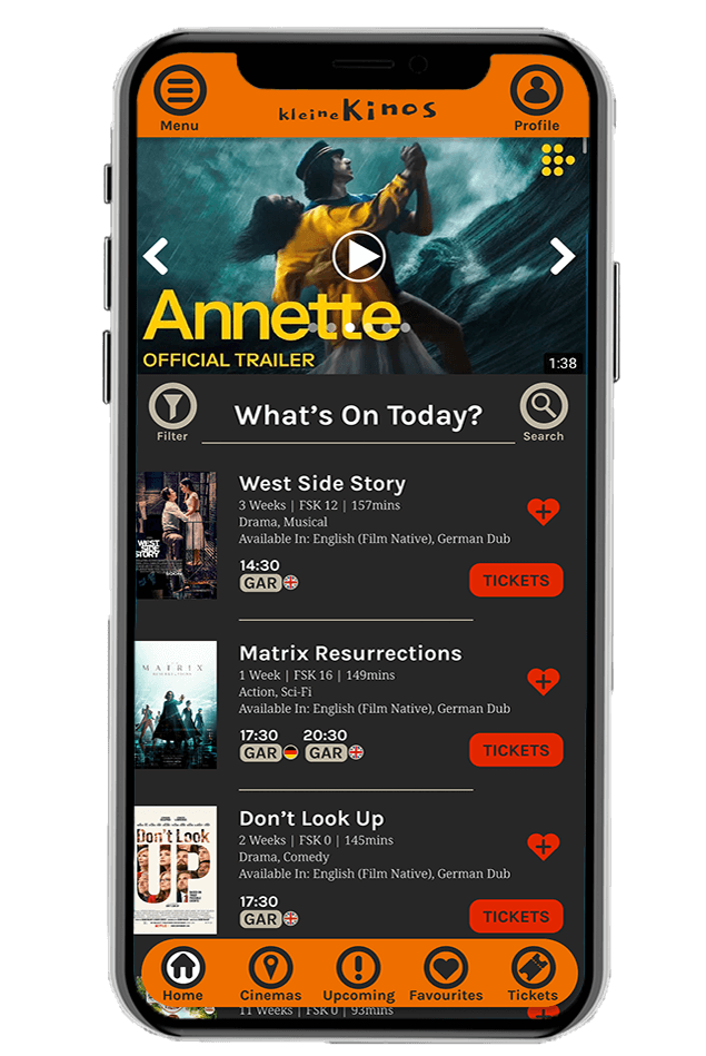
Main App Features
What’s On Today Section current movies with robust filter options
Why this feature?
In my initial interviews there were a mix of people who wanted either an overview of everything on offer, or specifically a look at what’s on today. Almost all my interviewees from the early stages also told me that going to the cinema was usually a spontaneous decision and a daily overview of the available movies seemed the best choice.
Filters were also deemed very important in both the initial interviews and low-fidelity usability study so I ensured that there were multiple filter options to help users find their perfect movie.
In-app Trailers with multiple language options
Why include this?
During my competitive audit, one of my favourite aspects from other cinema apps was having easy access to the trailer at the top of the screen. However, in the German cinema apps there were no options to change the trailer language which did not line up with the user needs I determined in my early studies.
I received very good feedback from users in my low-fidelity study about the multiple language trailer feature and decided to retain it for future iterations to make it easier for users to watch trailers in their language of choice.
Language Markers for all available films
Why this feature?
During my low-fidelity usability study it was made apparent by some users that seeing the language of each movie would assist with the overview aspect of the “What’s On Today” page. Thus I ensured that the language options for the film were present in the overview.
It was brought to my attention by numerous users in the high-fidelity study that they were uncertain what language each session was playing in. To help make this clearer I decided to add language flags next to each session time to help users better determine at a glance what language a film is playing in.
Cinema Information Section incl. Movie Overview, Address, Map, Photos, Accessibility, Corona Rules
Why include this?
Since there are multiple cinemas as part of this design, I believe it paramount to have a page where the information and in these times corona rules are clearly laid out.
In my initial interviews there were calls for images of the different cinemas (even some from inside the cinema), corona rules, addresses and maps, so I included this information in the “cinema menu” on the cinemas page. I also believed it important to add accessibility to that list to ensure inclusivity and accessibility in my design.
Upcoming Films with ability to pre-book premiere tickets
Why this feature?
There were some apps that I noticed during my competitive audit that contained an “upcoming” section for new movies on the horizon. I considered this a good concept to help drive continued and future interactivity with the app and decided to include it.
The feature received positive feedback in both the low-fidelity and high-fidelity usability studies, with numerous users excited about seeing the upcoming films and being potentially able to pre-book premiere tickets. As a result it remained part of the final designs.
Simple-step booking system with QR Code Ticket Page accessible from the bottom bar
Why include this?
The centrepiece of the app, namely being able to book tickets, was something I worked hard on and took cues from my competitive audit regarding how many steps the process would contain. I opted for an extra screen but larger text and CTA buttons to ensure users didn’t feel overwhelmed with information. This choice was well regarded in my usability studies.
Many users also appreciated having their ticket a mere click away, with a convenient location for their QR code on the far right of the bottom menu.
One user also made a wonderful suggestion regarding the ticket-holders; they asked if it would be possible to send the ticket to their partner if they were unable to arrive at the same time. This was a great suggestion and I found a way to work it into my designs and the app itself by including “secondary ticket holders” which could be autofilled from “frequent companions” to make the process swifter and more shareable.
Profile with autofill options
Why this feature?
The user profile includes a number of options to enhance and simplify the booking process on the kleineKinos app. The user’s name, address, email, payment information and frequent companions can all be saved for the purposes of autofilling them in a booking process. After a striking suggestion from a few users about inviting friends and wanting separate tickets despite booking at the same time, I rested on creating a section for “frequent companions” to streamline the process. If a user forgets their friend’s email address, they can already pre-fill their information if the contact is saved under frequent companions.
Users can of course opt out of this, but the information will then have to be typed in during the booking process.
Favourites section with ability to control notifications
Why include this?
Favourites was a topic that came up at all stages of my process from initial interviews to the high-fidelity usability study.
Users want to be able to save favourite movies and many wished for the chance to be notified if movies in their favourite genre, or at their favourite cinema, became available.
At first I ensured that there was a section for favourites in the menu and that there were options to save favourite cinemas and genres in order to be notified of new releases for either. However, during the low-fidelity usability study some users asked that the favourites be accessible via the bottom bar.
I also initially made favouriting a movie possible only from the movie’s description page, but after a user in the high-fidelity study requested the ability to do so from the home page, I made the action available for each movie on the home or filtered pages.
Light & Dark Mode
Why this feature?
Since light and dark modes were introduced I strongly stand by the need for a dark mode, especially when browsing at night.
As a result I ensured that my app design had a dark mode available for use.
Interestingly enough, the users I interviewed during the high-fidelity usability study preferred the dark mode by an overwhelming majority, leaving me very glad that I included it as part of my designs.